Web Analytics is not just pulling numbers from the Web Analytics tools and reporting numbers, it is much more than that. As an Analyst, your task is to report the numbers in a presentable and descriptive manner with analysis but also give suggestions on how to continuously improve the website in terms of appeal and ease of use. This article will touch base on the 3 major website conversion testing methods: AB Testing, Multivariate Testing and Segmentation Testing.
AB Testing or Bucket Test as you might call it is a way to test 2 variations of a page in order to determine which page is more successful in terms of pulling people towards a website goal. We split traffic on each page based on a defined proportion (50/50, 90/10). Usually the first step where there are most chances of convincing a user to buy something is the homepage as this is the page that defines a website in terms of visual appeal, product listing, ease of navigation, color scheme and even text. These things go a long way in generating a sense of trust in the users. For e.g. we have a website whose business model is selling books and there are 2 AB Test pages with the first page being the Control (original) having a discount offer banner on the top and the second page doesn’t have any discount offer banner but a slideshow listing the top selling books. We will then put tracking codes on both these pages and identify each page with a unique identifier in order to measure each page’s success. This success is usually measured in terms of the Conversion ratio which can be measured as: Visitors on the Conversion page/Visitors on the Test/Home Page. Some tools that can help you achieve AB Testing are Google Website Optimizer, Verster, SiteSpect and SplitAnalyzer. Below is a screenshot depicting a typical AB test report.
The second and the most efficient method to optimize your page is known as a Multivariate Testing. In this method, we don’t use multiple pages to determine a higher conversion rate but we test the same page by changing the elements around. For e.g. we can test headlines, colors, buttons and images on the same page by correlating each element with each other to find the best possible combination/element. The method used to achieve this is known as the Taguchi Method. This method takes into consideration the sample size and how long a test should run in order to have a clear winner. Google Website Optimizer uses this method to measure a multivariate test. This tool lets you view the various combinations and elements separately and then based on the Taguchi method decides the winner. All you need to do is add a tracking code on to your page and Google Website Optimizer will then split the traffic equally on each element separately. Please look at the below screenshot to understand how Google Website Optimizer measures a multivariate test. Some other tools that can help you achieve multivariate Testing are Google Website Optimizer, Optimost, Memetrics, Verster, Maxymiser and Omniture Test&Target.
Another form of testing which can be used to target specific segments like country, keywords, referring domains and direct traffic is known as Segmentation. In this we split the traffic based on a defined segment and then track the success factor/behavior pattern of each segment. This is the first step to achieve Behavioral Targeting which is in itself a very powerful way to understand user patterns. Please look at the below mockup segmentation test report screenshot.
Again the best KPI to measure the success is the Conversion rate. Some tools that can help you achieve Segmentation are Google Analytics (Free), Kefta and Maxymiser.
Product management, data management, tag management, Adobe solution integrations and data analysis will be some of the themes of this blog but I may write about other relevant topics occasionally.
Sunday, March 23, 2008
Sunday, March 9, 2008
Content Management System Walkthrough – Joomla and Drupal
A Content Management System is used to handle website content which can include text, images, audio, video etc. A CMS allows you to create a website without having any prior knowledge of programming. For the past couple of weeks I tried my hands on open source content management systems. The 2 premier open source content management systems in the market are Joomla and Drupal. The names sound funny but these 2 tools are one of the most robust tools available which can give any other CMS tools a run for their money. It was a tough couple of weeks to figure out the installation process of setting up the Content Management systems. After going through tons of articles on the Web, I managed to successfully install these on my machine.
Through this article I’ll try to share my experience in setting up the CMS tools in a local environment. Following are a few tools you would need on your machine in order to properly configure these CMS tools:
1) IIS (Internet Information Services/Apache Web Server: You can install IIS on your Windows XP machine by going to Control Panel -> Add or Remove Programs -> Windows Components Wizard and select IIS from the list as shown in the figure to install it. IIS is a Web Server which enables you to publish your webpages in a local/global environment. I didn’t use Apache but you can use it instead of IIS.
2) PHP (Hypertext Preprocessor): PHP is a Server Side programming language used to produce dynamic Web Pages. We don’t need PHP to do any sort of programming in this walkthrough but it is pivotal as the CMS tools we are using contain pages created in PHP. PHP can be downloaded at www.php.net. Once you have installed the PHP executable and setup your IIS Server, you can test whether your PHP is working correctly or not. You would need to create a document test.php and enter the following text in it: ?php phpinfo();? included in <> tags. Save the test.php and place it in this folder: C:\Inetpub\wwwroot\test.php which is your IIS Server’s root directory. Once all the above steps are complete, test your PHP installation by going to this URL http://localhost/test.php. If you see the page as shown in the image, it means that PHP is successfully installed on your machine.
3) MySQL Server: MySQL is a free open source database that has all the features that an expensive server can have (For e.g. SQL Server, TeraData costs can go up to thousands of dollars). Joomla and Drupal make use of MySQL as the back-end which provide storage for all text content and configuration settings. You can download MySQL Server from www.mysql.com but don’t forget to download the MySQL administrator (Image below) as well which will provide a front end GUI (Graphical User Interface) for your databases. Configuring and Installing MySQL is very simple and easy but if you do face any problems, you can always search the Web. It is however mandatory to create a username and password which you will have to use in order to install Joomla and Drupal. (Note: One of the biggest problems I faced after the installation of MySQL and PHP was getting MySQL compatible/talk to PHP. Basically there are a lot of extensions or Dlls that you might have to play with or change in order to create a successful connection between MySQL and PHP. I still can’t figure out which exact extension was responsible for making these 2 tools compatible but it is either php_mysql.dll or php_mysqli.dll. So if you are unlucky, then you might have to wait a little longer than expected to make Joomla or Drupal work. However, I finally managed to make these 2 tools talk by installing EasyPHP which is explained next.)
4) EasyPHP: This tool allows quick compatibility of PHP with the Web Servers and databases. It was only after installing this tool was I able to access Joomla and Drupal on localhost. This tool will install all the extensions that PHP needs in order to create a connection with MySQL. You can install EasyPHP from http://www.easyphp.org. Once you have installed and executed EasyPHP, you can see an E icon on the taskbar (bottom right of your screen). Right click on that and go to Configuration -> PHP Extension. Once you see the box as shown in the below image, you should select all the extensions listed in the box as it will install the necessary Dlls.
Once you have completed the above steps, then you need to install Joomla which you can download from www.joomla.org and Drupal from www.drupal.org. Choose the latest installation versions (I chose these files Joomla_1.0.15-Stable-Full_Package.zip and drupal-6.1.tar.gz) and extract these files in the root directory of your Web Server (C:\Inetpub\wwwroot\joomla and C:\Inetpub\wwwroot\drupal). Once you have extracted these files, you would need to create respective databases for these 2 tools in MySQL Administrator as shown in the below image.
Finally you would need to go to http://localhost/joomla/index.php and http://localhost/drupal/index.php in order to install these 2 tools on your machine. While installing these tools, it would be required to create a connection with MySQL Server in order for these CMS tools to publish their files on the database by entering your MySQL credentials as defined earlier. Once your installation is complete, you should see the following pages as shown in the last 2 images.
All in all it was a nice experience learning the CMS installation procedure as it has added a new dimension to my career and also a skill-set. Hopefully you like this article and let me know if you have any questions regarding the rigorous installation process as I’ll try my best to help you.
Labels:
Content management system,
drupal,
IIS,
joomla,
web development
Tuesday, February 26, 2008
Page View Metric – Is it really dead?
I read an interesting post regarding the Page View KPI no longer being part of the Web Analytics metrics in the future as Nielsen/NetRatings have decided to scrap Page views from their rankings. The article alleges that the Page View metrics is incapable of telling us about the overall user experience as nowadays most websites make use of widgets, videos , flash, AJAX content etc and it is impossible to measure those attributes with the use of Page Views. The article mentions “If you have widgets, you don't really have page views. If you do videos, you don't have page views.”
Will Page Views suffer the same fate as the Hits metrics? In the nascent stage of Web Analytics, Hits used to be the key metrics tracked in place of Page Views but as the Web Analytics community became mature, the Hits metrics was found wanting. This is because Hits measured everything from loading of images, CSS to JavaScript which meant that Hits will count all the individual requests and report them seperately which in turn was termed as inaccurate. One of the reasons why Hits noticed a quick exit was due to the fact that it could only be tracked via Server Logs and with the advent of conventional Web Analytics tools, it was easier to find a replacement in the form of Page Views.
Are Page views dead? Personally I think it is too early to say that. I say this because around 90% of the companies today would be using Page Views in their day to day reporting/dashboards and also all the major Web Analytics tools report this as a prime metrics. Page Views have been widely accepted as an industry standard and it would be really difficult to replace it immediately as a suitable replacement would not be easy to find. Though we have noticed in the past that Visits and Unique Visitors have been considered a better metrics than Page Views but it doesn’t really mean that we can totally discount Page Views as they have their own value in Web Analytics.
What can be the possible replacements for Page Views? I don’t think the existing prime metrics like Visits, Visitors would replace it but I agree with what was written in the article about User Engagement. User Engagement according to me is the Visitor experience on a webpage ranging from clicks on specific links, interaction with the embedded applications like Videos, Widgets etc and most importantly Time Spent. Based on my experience, I’ve noticed that majority of the exits on a website happen within the first 15 seconds and it is crucial for us to decrease the exit rate for this time range. Ideally in case of eCommerce websites, a user session should range between 5-10 minutes as I think by this time the user is well adept with the website interface. He would then decide to perform the appropriate task like filling a form to buying something. Similarly the user engagement metrics would be different for a content, classifieds and News website. So the Time Spent metrics is in a way a subset of User Engagement.
All in all I think it is too early to totally discount Page Views from Web Analytics but sooner or later the industry will decide to replace it. But whenever that happens, I sincerely hope that Page Views would be given a graceful exit unlike it’s predecessor Hits.
Sunday, February 17, 2008
Excel Alerts- A gift for Web Analysts
Microsoft Excel is the lifeline of most of the reporting done these days and it is imperative for an Analyst to present the data as visually as possible. So I’ll change gears this time and write about a very useful feature I learnt last week which I call as Excel Alert. This is not an in-built attribute in Excel but it resembles the properties of an Excel feature known as Conditional Formatting. This characteristic allows us apply formats like color, bold text etc on values in a cell or formula. For e.g. if we have 2 cells containing ratios, conditional formatting allows us to determine which is greater by highlighting either of the 2 cells in Red, Green or some other format.
This article will help you get introduced to yet another Conditional Formatting feature which will add more visual appeal to your reports. Instead of using CF we will make use of AutoShapes to determine a change in cell values. To accomplish this, let’s look at the below steps and screenshots:
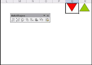
1) Open Microsoft Excel and go to Insert -> Picture -> AutoShapes. Choose Basic Shapes and select Isosceles Triangle from the list (You can choose the shape of your choice). Select a cell and draw the shape in that cell (I have merged 3 cells and accommodated the shape) and rotate the shape of the Triangle if you want. Right click on the Triangle, select Format AutoShape and under the Fill section choose the color of your choice which in my case happens to be Red. Copy the Red Triangle, paste it in another cell and change the color of the shape to a different color. So now I have 2 shapes in Red and Green. Look at the screenshot.
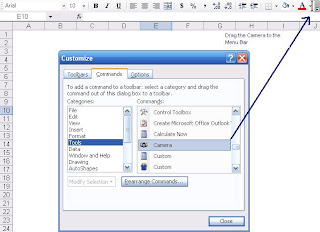
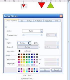
2) Next you need to go to Tools -> Customize and select Tools on the Left to view the goodies in the right section. Choose the Camera tool from this list and drag it to the Menu bar. Now select the cell with the AutoShape and click on the Camera icon. Start drawing the shape again and you will find a replica of the AutoShape you first created. Then as you can see in the screenshot, right click on the newly captured AutoShape and choose Format Picture. In the Colors and Lines tab, choose the No Fill and No Line options from the Fill->Color and Line->Color drop downs respectively. This will get rid of the outer boundary of your captured AutoShape. Have a look at the screenshots below to follow the steps.
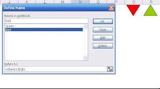
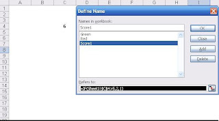
3) Then we need to name our 2 AutoShapes which we can do by going to Insert-> Name-> Define. Once there, we need to define the cells where the 2 Shapes are placed. In my case, I have referenced the cells and named them according to the color of the Shapes. This step is really crucial because we uniquely define the Shapes as these are the definitions by which we will be referencing them.
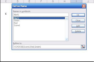
4) Now let’s look at the final step which deals with the definitions of the Alerts. First we have to define the cell where we will be displaying the number with name ‘Score1’ and statement = IF(Cell-value>5, 2, 1). The simple IF statement in the example validates the condition which in this case means if number is greater than 5 then choose 2 else choose 1. Finally we need to define the Alert which will be displayed next to the number validating the condition. Please look at the Step 4a image which shows that we have defined the Alert1 with the formula =Choose(Score1,Red,Green). This formula is helpful in providing an alias for the numbers used in the previous IF statement. So 1 means Red and 2 means Green.
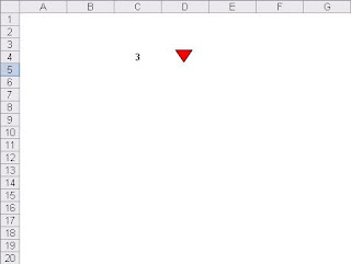
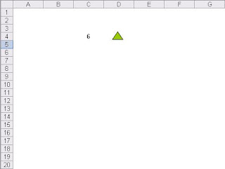
5) Now if we change the values in Cell C3 to a number lower than 5, we will see the Alert as Red and vice versa. Please look at the final 2 images which will give you an idea as to how these changes will take effect.
You can also download this file here. I hope you like this post as I think it was a refreshing change from the usual topics.
Labels:
analysis,
conditional formatting,
data analysis,
excel alerts
Sunday, February 10, 2008
Debugging your Web Analytics Code
I came across a question on Yahoo Web Analytic Group regarding debugging tracking code on a webpage without having access to the Web Analytics tool. The answers to this question can be more than one but based on my experience, the best way to check Web Analytics code on a page is to use a Packet Sniffer.
A Packet Sniffer or HTTP/JavaScript Debugger as it is known is a tool that analyzes and parses network traffic. There are many other uses of a Packet Sniffer but in this case we are only looking at capturing HTTP/JavaScript packets. So if I have a webpage containing Google Analytics code, all I need to do is activate this software while the webpage is being loaded. Once the entire code snippet on the page has been loaded, you can go to the Packet Sniffer tool and search for the Google Analytics code from the list of captured packets.
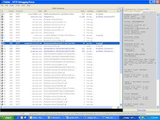
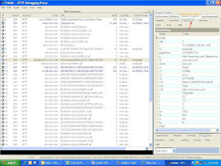
Let us look at an example by going to www.msn.com and capturing the Omniture Web Analytics tag on their webpage using a tool called Fiddler. Please look at the 2 screenshots captured after the MSN-US page load was complete.
The first image is an overall summary of all the code being rendered with the Omniture code highlighted in Blue. Please note that for an Analytics JavaScript code to be successfully rendered, it has to make a ‘Status 200' call to the respective Datacenter meaning the request has been completed. Now double click on the captured snippet and look at the second screenshot for the next step.
After double clicking on the Omniture code, you will have to click on the Web Forms tab on the top right in order to view the various parameters being passed onto Omniture. You will notice all the various parameters being sent to Omniture like the Page name, Language, Screen resolution and so on. This step will also tell us whether the custom variables we passed on the analytics code are being sent correctly or not.
Packet Sniffers have a very important role to play in Web Analytics as they can help fix issues like data not being present in the reports to discrepancy in numbers. Finally listed below are a few more HTTP Debugger tools that I’m aware of:
1) Adobe Experience Cloud Debugger
2) Charles Proxy
3) Debugger for Adobe Analytics
Labels:
Adobe Analytics,
packet analyzer,
packet sniffer,
QA,
web analytics code
Sunday, February 3, 2008
A peek at Digital Advertising Banners
My last post mentioned the various Web Advertising deals that take place between advertisers and publishers. This post will help us understand what is pivotal in ensuring that these deals are successful. You must have come across various advertising banners displayed on websites like Yahoo, MSN etc. We will now take a closer look at the different kinds of Web Banners present today.
1) Banners and Skyscrapers: Banners were one of the first Web Adverting units introduced in the Internet. They are complied of specific measurements which can range from 234*60 to 468*60 pixels. They are created from JPEG, GIF images and will generally be displayed on the top just below the heading of a website or at the bottom. However while scrolling down the webpage we might loose sight of them as they are mostly displayed on top. Skyscrapers/Sidebars on the other hand are tall Ad units displayed on the right or left portion of the webpage making them visible throughout the scrolling process. They are mostly displayed as 120*600 pixel banners. It is therefore essential to select the kind of banner you want to display on your website depending on its CTR (Click through Rate). Google Adwords and Adsense make use of various banners that are displayed on its search results and publishing websites respectively.
2) Floating Ad Units and Multimedia Ads: Floating Ads are displayed once a visitor lands on the homepage and these units are known to travel on the page during the scrolling process. They are usually designed in Macromedia Flash to draw the attention of the user and entice him to click. However they can be annoying for a lot of users as they completely superimpose the text area on the Webpage. Multimedia or Unicast Ad is typically displayed as an animated video/audio message designed especially to replicate a television.
3) Popups and Pop Unders: Popups are banners that are displayed in the form of a new browser window displayed onto our screen. It is immediately displayed after a user visits a website. However a Popunder browser window opens itself underneath the parent website usually getting unnoticed during the initial entry to the website. Again they are designed primarily to grab the user attention and encourage him to click. These Ad units are known to be more successful than Banners and Floating Ad units in terms of getting more clicks.
4) eCommerce Widgets: A Widget is a snippet of code that can be embedded in a website and it is the latest inclusion in the ever-growing Web Advertising field. For e.g. An Amazon widget can added to a webpage for selling books, software etc. The Widget advertising model almost follows the PPA (Pay per Acquisition) which is described in my last blog post. So if a user buys a book through a widget embedded on a website, the publisher will be entitled to receive a portion of the Book cost. I recently read an article mentioning about a Widget called the ‘Paypal Storefront Widget’ which is especially made for Blogs and Social Networking websites. This widget offer services such as in-widget shopping carts, product description, thumbnail gallery etc. Unfortunately this widget is only available for Typepad Blog users. Widgets like these help tap the enormous potential of eCommerce and with such tools Internet can only get better.
These were some of the banners which are the most prevalent today and it should be noted that there will be newer and more creative Web banners that will hit the Internet sooner or later. Having more and more of these banners on your webpages will obviously enhance your earnings but we should always draw a line between the acceptable and uncomfortable user experience which according to me is of the utmost importance. I hope you like this post and if possible share your opinions.
Sunday, January 27, 2008
My take on Digital Advertising KPIs
How does a content websites make its revenue? The answer is simple and it's the same concept that magazines, radio and newspapers have adopted which is by selling ads. By selling ads, I mean the source (publisher) website displays banner ads of other target websites/businesses (advertisers) on their website based on an advertising deal which I will focus on specifically. These display banner ads are tied to a campaign that the advertisers would run on their end which can either be sending users to a homepage or sending them to conversion funnel. The advertisers measure the performance of these banners based on 3rd party ad serving tools which in most cases the publisher would also be using to track progress on their end. The aim of the publishing website is to get as many users visiting the website so that the likelihood of it making money increases. The publisher typically gets paid based on primilarily 4 deals listed below:
1) CPC (Cost per Click): This metrics specifies that if a visitor clicks on the banner and lands on the advertiser’s website, the publisher of that ad will get a specific price. More the visitors, more the clicks and eventually more revenue. It is measured as CPC (Cost per Click).
2) CPM (Pay per Thousand Impressions): This deal is primarily based on the volume of traffic landing on the website. The publisher will be paid X amount per 1000 Impressions (Page Views) on the page hosting the Web Banner. The deal can range from 50 cent CPM (Cost per Thousand) to $50 depending on the publishing website.
3) CTR (ClickThrough Rate): This metric captures how many times an ad was clicked compared to how many impression were served. The higher the CTR, the more engaging the media content. This metric is typically calculated along with the website or Mobile app conversion rate which is often used as the final success criteria
4) CPA (Cost per Action/Acquisition): This is my favorite. Based on this deal, the publisher will only be paid if a visitor from its website performed a predefined action like converted into a customer by buying from the advertiser. In this case, the publisher will be paid a portion (0-50%) of the cost of the product.
5) CPV (Cost per Visit):Though this is not a very common metric, through this an advertiser is able pay the publisher based on the number of times visitors have visited the page. (A Visit is a session on a website which occurs within a time frame for the same Unique Visitor. The universal web analytics time frame standard set for Visits is 30 minutes but it can be changed).
I can add one more to this list which is MGR (Monthly Gross Revenue): This is more applicable to online Poker business. According to this deal, the publisher will be paid a share of the monthly gross revenue generated by a Poker player.
These banners can be targeted based on country (I.P.), search terms, source of traffic, day parting (Serving Ads during different time periods) etc which is made possible by tools like DoubleClick etc and can be used by both publishers and advertisers to track banner performance at their end. These tools help both parties to track display banners and manage campaigns like advertising deals and landing traffic.
All in all banners are an integral part of the display advertising business model and they are here to stay. Here's my article on different kinds of banners present in the industry today.
Labels:
banner advertising,
CPA,
MGR,
online advertising,
PPC,
PPM
Sunday, January 20, 2008
10 Ways to lower Drop off Rate in a Conversion Funnel
My last article mentioned ways to measure the drop off rate but through this article I’ll try to list ways by which you can reduce the drop off rate. Drop off Rate and Conversion Rate are two sides of the same coin as the below points would relate to both equally. A Conversion Funnel can start from the homepage, a search results page or a campaign specific page. Now let’s look at some of the ways by which we can reduce drop off rate:
1) A/B or Bucket Testing: A/B testing means testing many variants of the Conversion pages (Homepage, Product View etc) by sending a proportion of traffic on each page and eventually determining which page led to the minimum drop off or the highest Conversion. The important factor to keep in mind while conducting A/B test is that one of these pages should be the control (the original page). We can test pages by changing button color, size, text, placement etc or by modifying forms in order to minimize the customer drop off during the Registration process. Eventually by using a unique page name/bucket page name we should be able to determine which page performed the best.
2) Segmentation Tests: These are different than Bucket Test because in Segmentation we are looking to target certain segments of customers/users. We target customers based on their status (New user, not yet registered and Registered Customer). The “not yet registered” customer segment should see the login page so that he can continue the Conversion process where he left it. Similarly new users would see a different page and registered customers see a page only listing products of their choice. We can also segment customers according to their country (I.P.), Campaign Tracker ID, Direct/Indirect source of traffic. Ultimately we want to be able to determine which segment has the lowest Drop off/Highest Conversion rate.
3) Products Out of Stock: This is one of the mistakes that online retailers might make in order to make a customer purchase a product by pretending that the product is in stock when it is not. When the customer actually believes and purchases the item then guess what he gets an error message saying “Payment failed as Product out of stock”. I’m not saying this is a common practice but this scenario is possible and when it does happen it will surely leave a bad mark on that customer and maybe potential customers. So if a specific product is out of stock, then make sure you don’t display it.
4) Detailed Product Description: One of the reasons why sites like Amazon and Dell are pioneers in Online Shopping is because they make sure they provide the in depth coverage of the product. The users should also be made well adept with the specs of the product before they enter the cart with detailed textual description along with pictures. Sometimes including user comments also help.
5) Hyperlinks to Popups: While in the Conversion Funnel, a user might be distracted to click on a link/button that he finds appealing and this is the time when most customers leave the page. So in order to minimize that point of drop off, try to create links that open a new browser window/popup in order to retain the users on that page. It is however a highly debatable point because we need to be able to measure the links which lead to the customer exiting from the Funnel (Exit links). So I would suggest you to include links to Terms and Conditions, Privacy Policy, Product Specs and others in the form of popups so that you do not loose the customer in case he doesn’t go back in the Conversion process.
6) Trust: If your company is a public company/Fortune 500 company, always mention it on the Conversion funnel pages. In case of other companies, be sure to display a secure page icon (Verisign) on the encryption pages in order to generate a sense of trust for the customers. Having a privacy policy and terms of conditions page is also very important. A clearly defined Privacy Policy goes a long way in making the user feel secure before making a payment.
7) Shopping Cart Indicator: It is very important for visualize the Shopping Cart through a Step indicator on Conversion Cycle pages. As soon as the user selects a product you need to make him feel as if he’s entering a Shopping Cart and also listing what step it is so that he knows exactly where to go next.
8) Simple Registration Process: Try to make the registration process as simple as possible and try to minimize asking questions about PII (Personally Identifiable Information). Make sure the spellings are correct in the Registration process as it can really leave a bad taste for the user experience. Include as much predefined information as possible to reduce the amount of information the user has to fill in. For e.g. If a user has selected UK as the country then if possible auto populate the City, County, Country Code in the drop downs/text boxes and let the user select from that list rather than him entering it manually. Also radio buttons can work better then drop downs in most scenarios especially if there are only 2 choices.
9) Search Functionality: It is usually not advisable to include a search text box in between the Registration process but having it would only make things better. I say this because if a user wants to search for any information then he might want to exit the cart and go back to the Homepage. But if you have a search box which displays results in the form of a popup then you reduce your chances of jeopardizing your Funnel process by retaining the user on that page.
10) Web Analytics Tool to Measure KPIs: Finally the most important step is proper configuring of your Web Analytics tool to measure relevant KPIs or metrics. The Web Analytics code implementation according to the pages is of pivotal importance which hold true for Bucket Testing or Segmentation. The KPIs/metrics that might be of up most importance in case of the Conversion cycle can be Drop off Rate, Conversion Rate, Time spent on page, Exit Rate and Click Tracking.
These were just some of the ways that can help you maximize your ROI in terms of Conversion as there might be a lot more. I hope you like this article and if possible, let me know your thoughts about it.
Labels:
cart abandonment,
conversion rate,
drop off rate,
ecommerce
Sunday, January 13, 2008
Funnel Drop Off/Abandonment Rate
Drop Off or Abandonment Rate measures the number of visits/visitors who left a conversion process (funnel) without completing it. Any process with 2 or more actions on the site can be considered a conversion process but what you define as a conversion depends on the purpose of your site and your business objective.
Before I continue, I want to mention that Drop Off Rate is the opposite of Conversion Rate. Conversation Rate is typically calculated as (Visits of the Last Conversion Step)/Visits of the First Conversion Step) X 100. Some of the commonly used conversion funnels are eCommerce shopping carts, registration forms or lead forms.
Abandonment Rate helps identify the steps in the funnel that are causing users to drop off. Conducting analysis of those steps will help us take necessary steps to minimize the drop offs and optimize the conversions.
There are 2 ways to calculate Drop Off Rate and each of them provide the data in slightly different ways. Both of them are correct ways to calculate and are commonly expressed as a percentage:
1) Drop off/Abandonment rate = ((Visits of the Last Conversion Step-Visits of First Conversion Step)/Visits of the First Conversion Step) X 100. Let’s assume that we want to use Product as the first step of the conversion process and that step gets 10,000 visits. But of those 10,000 only 7,000 continued to the next step of adding the product to shopping cart. Then in the next step only 2000 out of total 10,000 that started the process continue to Registration form and finally 1,200 out of 10,000 got to the final confirmation page. This means we saw 30% abandonment between Step 1 and Step 2 ie. ((7,000 -10,000))/10000)*100. Abandonment was 80% from Step 1 to Step 3 ((2,000 – 10,000)/10,000)*100. Final abandonment rate was 88% ((1,200 – 10,000)/10,000)*100. Though this calculation gives us a good idea of final drop off rate and conversion, it can be a little misleading.
2) Drop off/Abandonment rate = ((Visits of the Current Conversion Step-Visits of the Previous Conversion Step)/Visits of the Previous conversion Step) X 100. This calculation takes into account the previous conversion step and the current conversion step. In the Funnel, we see that 7000 visits are measured on the Add to Cart page (Step 2) and only 2000 continue to the Registration form so the calculation based on this formula would be ((2000-7000)/7000)*100 which is -71%.
Based on the above formulas, it looks like the first one seems better in terms of Funnel visualization but personally I like the second formula better. I say this because in the second funnel, we are only considering the respective conversion steps in the calculation and not just Step 1 (Products) because Step 1 is entirely a separate user experience. According to me, the Drop Off Rate should be calculated based on two consecutive conversion steps as they are independent of the user acquaintance on the other pages of a funnel. These 2 pages alone can determine how we can improve the conversion rate at each step as these are not based on the Products page experience. For e.g. The Registration form design and engagement is totally different than what it is on the Products page.
Here's a link to a calculator I built which includes these two calculations for you to use. Please note that the first calculation only takes in the first and last step as it only calculates the drop off rate based on the first and last steps.
Here's a link to a post I wrote to cover some steps on how you can reduce funnel drop off. I hope you like this post and would love to hear your opinion on it.
Subscribe to:
Posts (Atom)